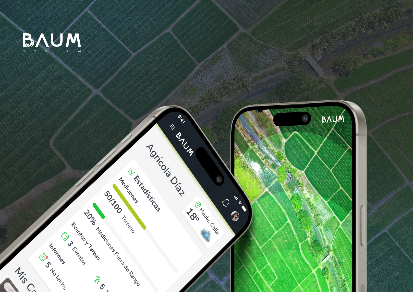
Project Overview
- Role: Lead UX/UI & Product Designer
- Services: UX/UI Audit, Information Architecture, Prototyping, Design System
- Industry: AgTech / SaaS (Agricultural Management Platform)
- Tools: Figma, Miro, Maze (Testing)
1. Context & The Challenge
BAUM is an agricultural technology platform designed to streamline operations, resource management, and decision-making for agricultural enterprises.
The Problem:
The legacy system had grown organically, resulting in a cluttered interface with high cognitive load. Field operators and agricultural managers faced severe friction when attempting to input operational data, monitor crops, and retrieve key analytics.
Key Pain Points Identified:
- Complex Navigation: Essential features were buried 3 to 4 levels deep in nested menus.
- Low Field Usability: Interfaces were not optimized for quick data entry on mobile devices under outdoor sunlight conditions.
- Fragmented Data Visualization: Farmers and managers lacked a unified dashboard to make real-time decisions regarding irrigation, inventory, and field activities.
2. My Approach & Process
To transform BAUM into an intuitive and efficient SaaS platform, I structured the redesign into four key phases:
Phase 1: UX Audit & User Research
- Conducted a heuristic evaluation of the legacy system to map usability bottlenecks and accessibility issues (contrast, touch targets).
- Mapped User Journey Maps for two main personas: Field Technicians (speed & offline clarity) and Farm Managers (analytics & reporting).
Phase 2: Information Architecture & Wireframing
- Restructured the navigation menu, reducing key task workflows from 5 steps down to 2 clicks.
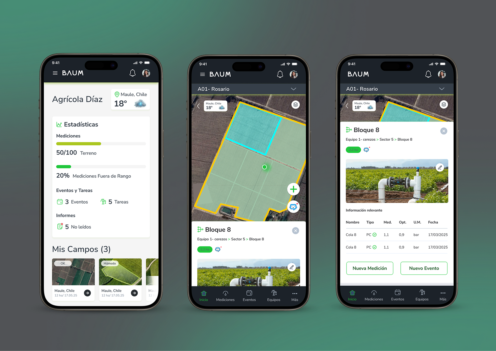
- Redesigned the core dashboard around a modular card-based system, enabling users to customize their views according to priority metrics (e.g., soil humidity, task execution, inventory alerts).
Phase 3: UI Design & Scalable Design System
- Built an end-to-end Design System in Figma with reusable UI components, clear typography scales, and WCAG-compliant color palettes (optimizing visibility for field use).
- Designed light and dark states tailored for mobile and tablet views.
3. Key Solutions Implemented
- Smart Dashboard: A unified hub showcasing real-time farm metrics with actionable quick actions (e.g., "Log Irrigation", "Report Issue").
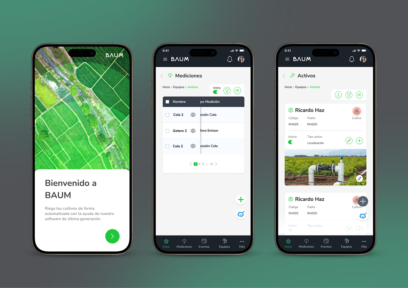
- Simplified Field Entry Flows: Form field optimizations with automated defaults, reducing manual typing on mobile devices.
- Interactive Data Tables: Complex data grids upgraded with advanced filtering, column customization, and seamless export capabilities.
4. Impact & Results
- Efficiency Boost: Reduced data-entry task completion time by ~40% during field testing.
- Lower Cognitive Load: Streamlined navigation reduced user errors in logging daily farm operations.
- Scalable Foundation: Implemented a componentized Figma library that accelerated front-end handoff and future feature integrations.