Project Overview
- Role: Lead UX/UI & CX Designer
- Services: Customer Experience (CX) Architecture, Mobile App Redesign, Prototyping, Design System
- Industry: Mobility Technology / Transport & Logistics / Smart Cities
- Tools: Figma, Miro, Usability Testing
1. Context & The Challenge
RUBI is an urban mobility platform designed to optimize public and private transit integration, offering users seamless route planning and micro-mobility access.
The Problem:
The original application suffered from high friction during multi-modal route planning and ticketing. Users faced confusing navigation, slow checkout steps for transit passes, and a fragmented customer experience when switching between different transport modes.
Key Pain Points Identified:
- Complex Route Decision-Making: Too many options presented simultaneously without clear visual indicators for arrival time, cost, or convenience.
- Friction in Micro-Payments: Ticket purchasing and digital wallet top-ups required multiple screen transitions, causing delays at transit turnstiles.
- Inconsistent Offline/Real-Time Data: Lack of clear system feedback when real-time GPS data was delayed or disconnected.
2. My Approach & Process
I led the end-to-end CX and UX/UI redesign to transform RUBI into an intuitive, high-speed mobility assistant built for daily commuters.
Phase 1: CX Journey Mapping & User Research
- Conducted field observations and user interviews to map the end-to-end commuter journey from home to destination.
- Identified anxiety triggers during transit transitions (e.g., waiting times, ticket scanning failures, balance shortages).
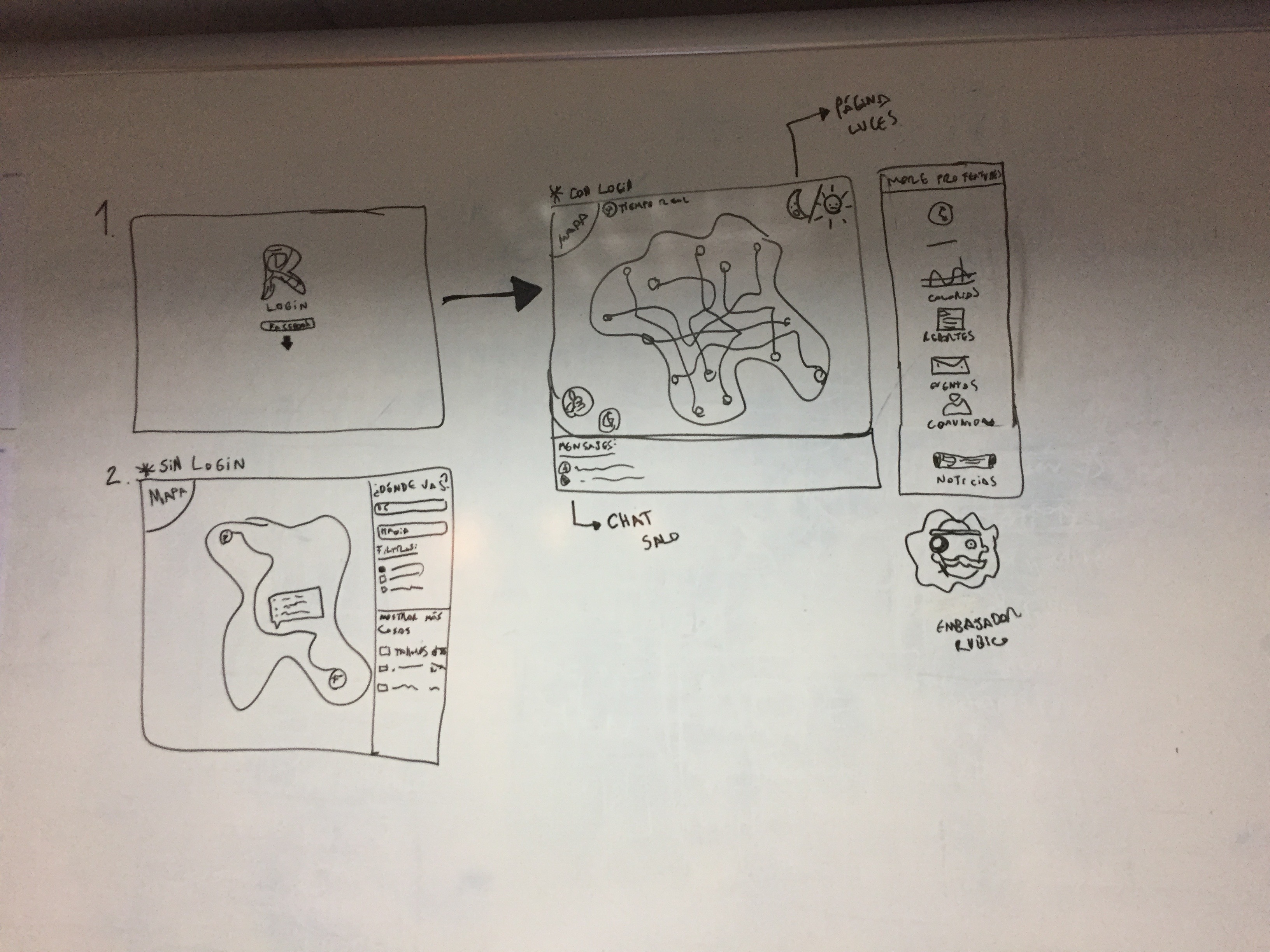
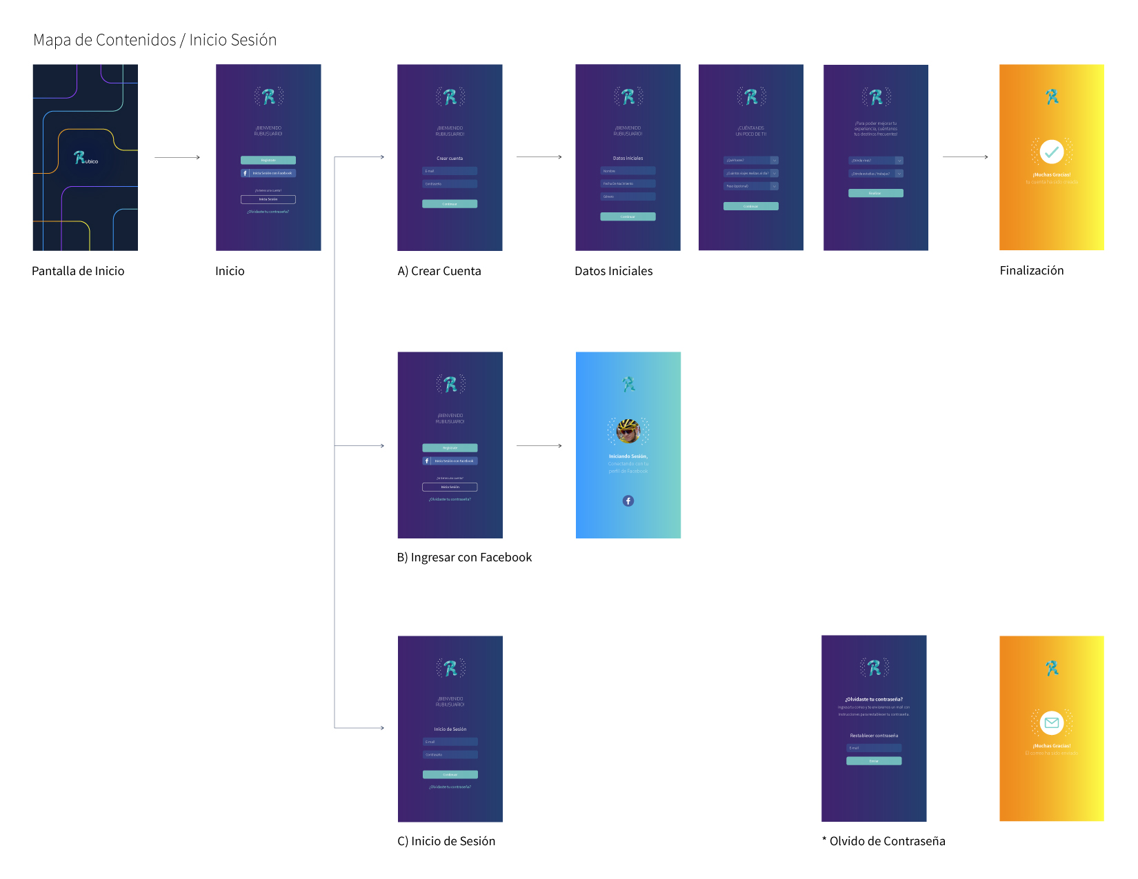
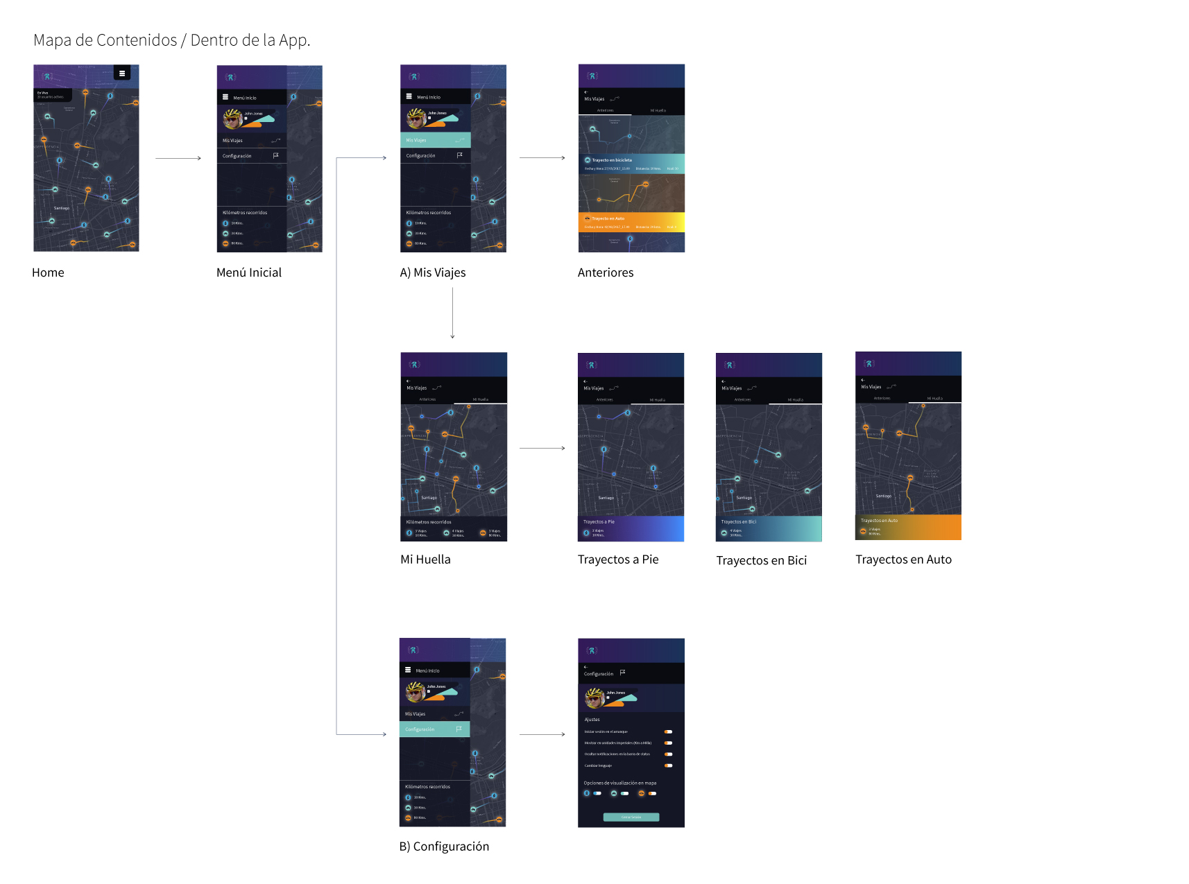
Phase 2: Information Architecture & Mobile Flows
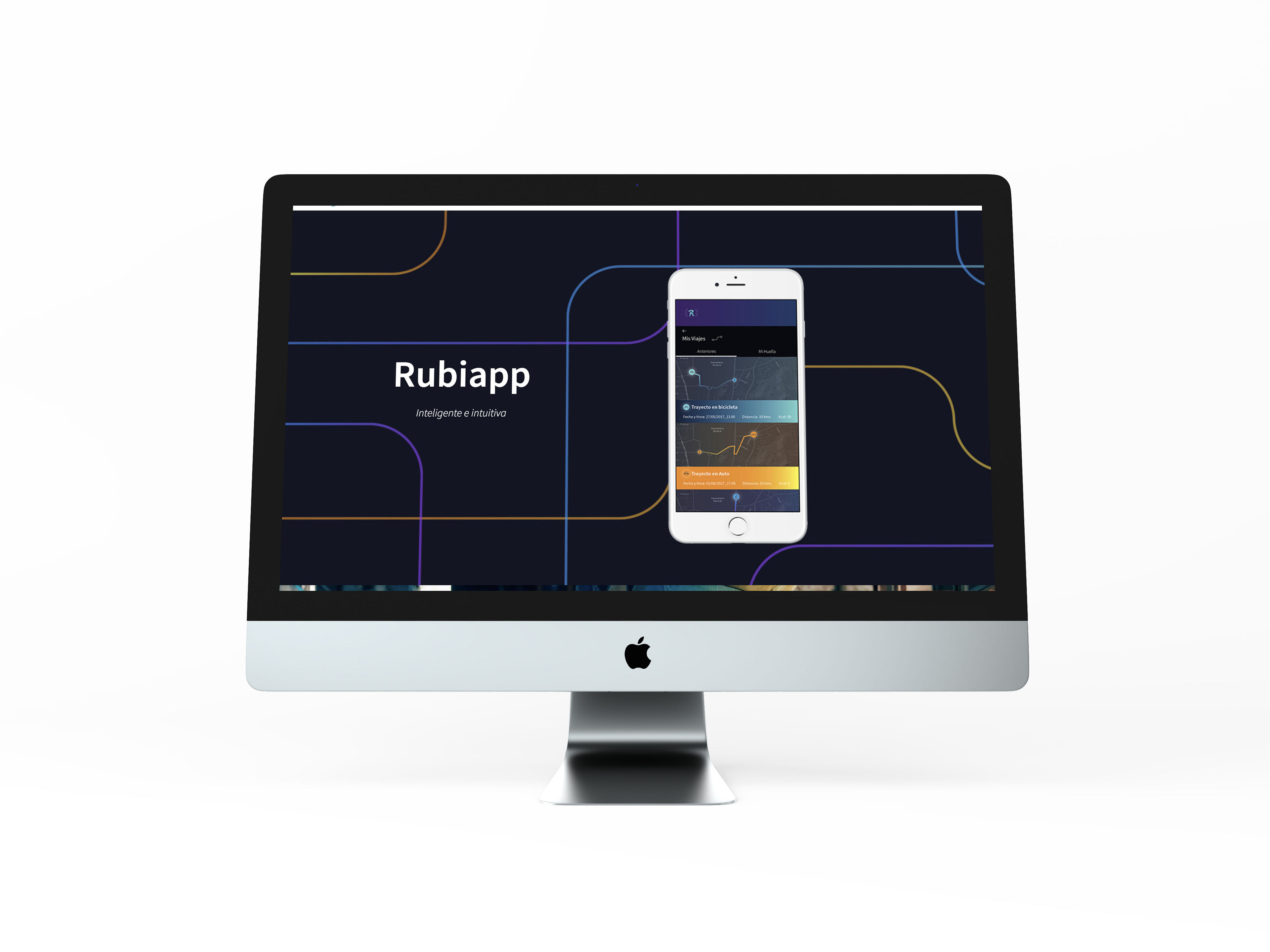
- Redesigned the primary route planner to prioritize dynamic, card-based trip options sorted by user preference (Fastest, Cheapest, Eco-Friendly).
- Streamlined the ticketing flow into a single-tap QR code generator integrated directly into the home screen.
Phase 3: High-Contrast UI & Accessible Design System
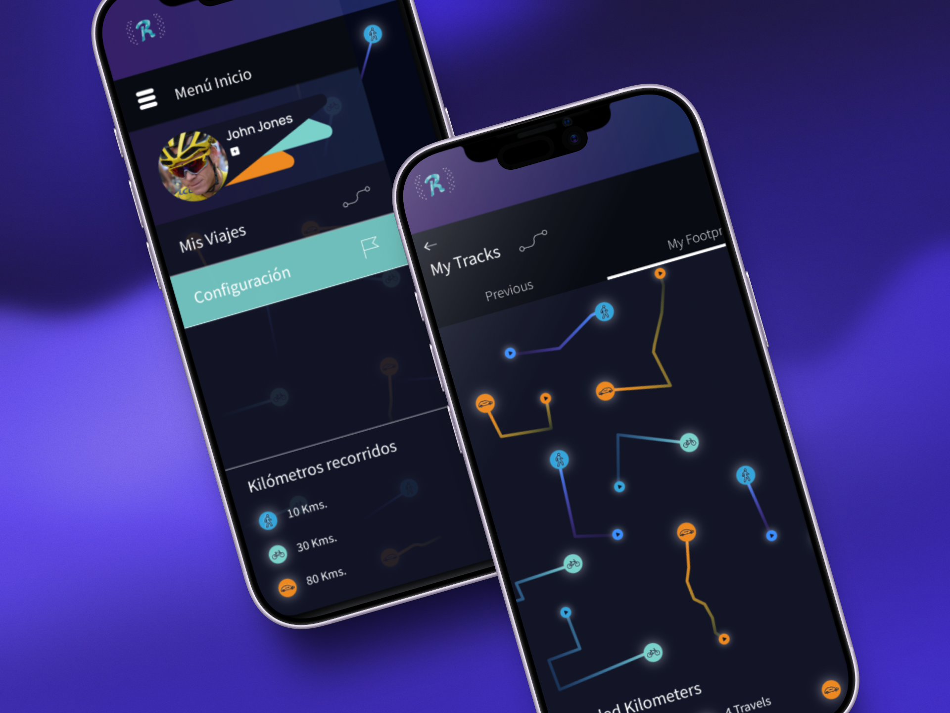
- Built a mobile design system in Figma tailored for outdoor usage, using high-contrast status colors, large touch targets, and clear typographic hierarchy.
- Designed dynamic real-time tracking components with clear visual cues for ETA and service delays.
3. Key Solutions Implemented
- Smart Route Planner: A clean interface that compares multi-modal transit options side-by-side with clear visual breakdowns of time, cost, and transfers.
- One-Tap QR Pass: A persistent digital wallet feature that allows users to scan turnstiles instantly without navigating through complex menus.
- Real-Time Transit Tracker: Live GPS map updates with clear system notifications for service disruptions or platform changes.
4. Impact & Results
- Reduced Task Completion Time: Simplified ticket generation and wallet top-ups, enabling faster transit access.
- Lower Cognitive Friction: Streamlined route options made decision-making significantly faster for daily commuters.
- Unified CX Touchpoints: Successfully aligned digital application features with physical transit interactions.

%2012.21.26%E2%80%AFp.%C2%A0m..png)
%2012.25.20%E2%80%AFp.%C2%A0m..png)